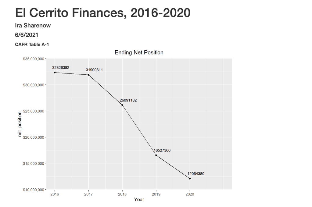
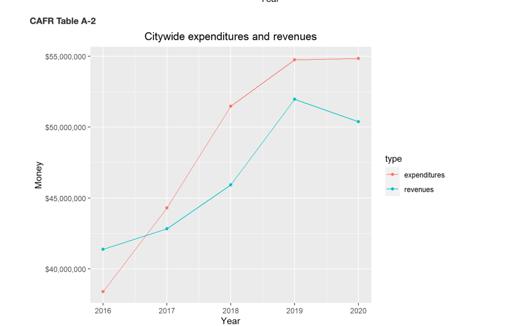
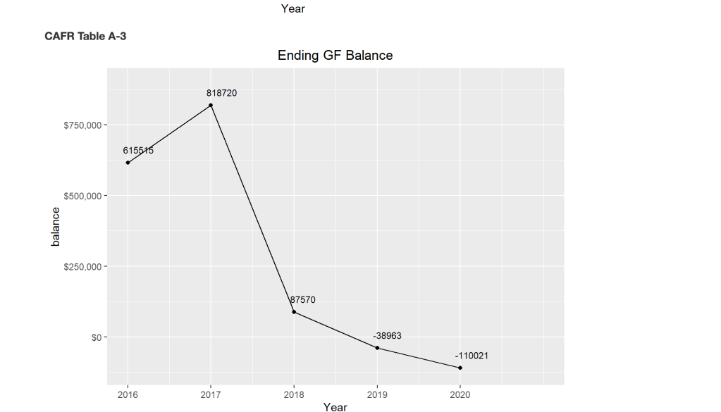
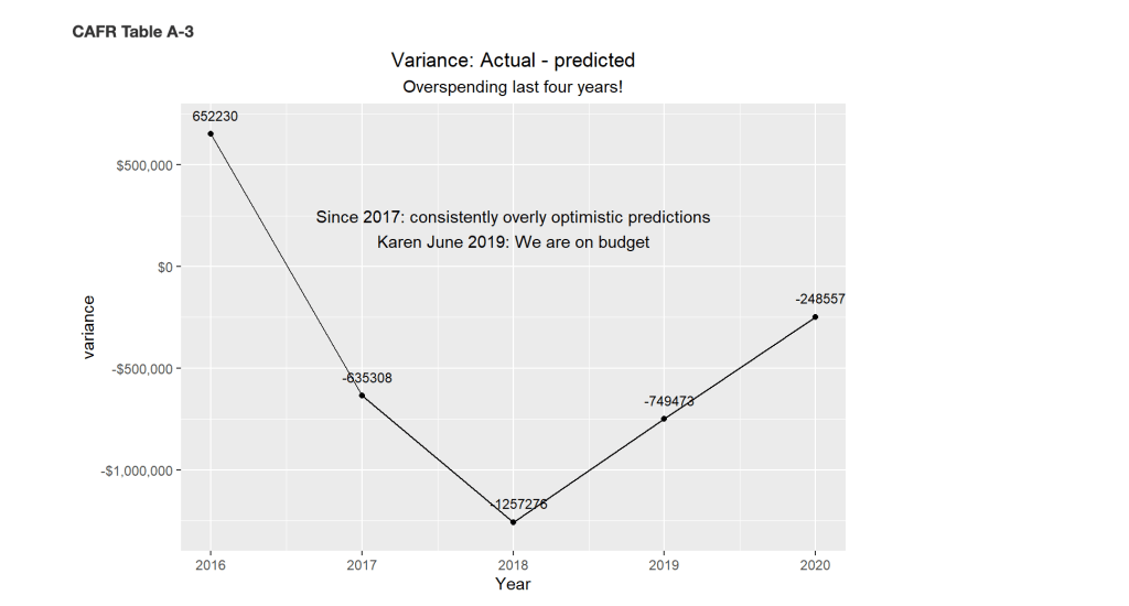
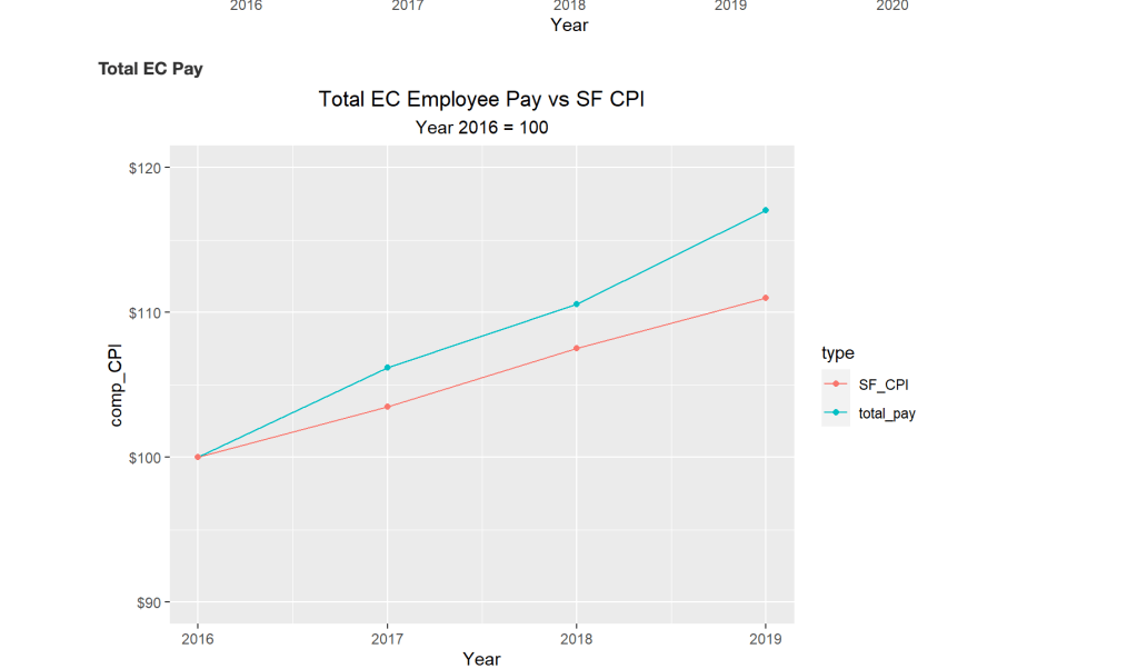
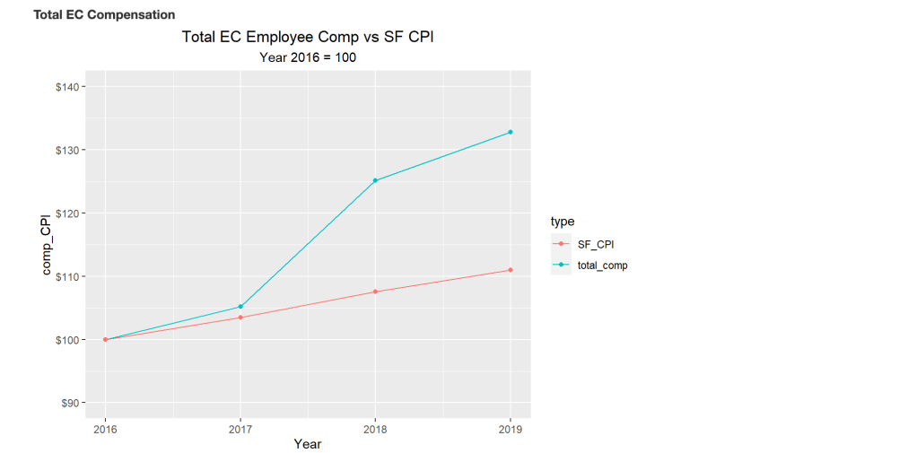
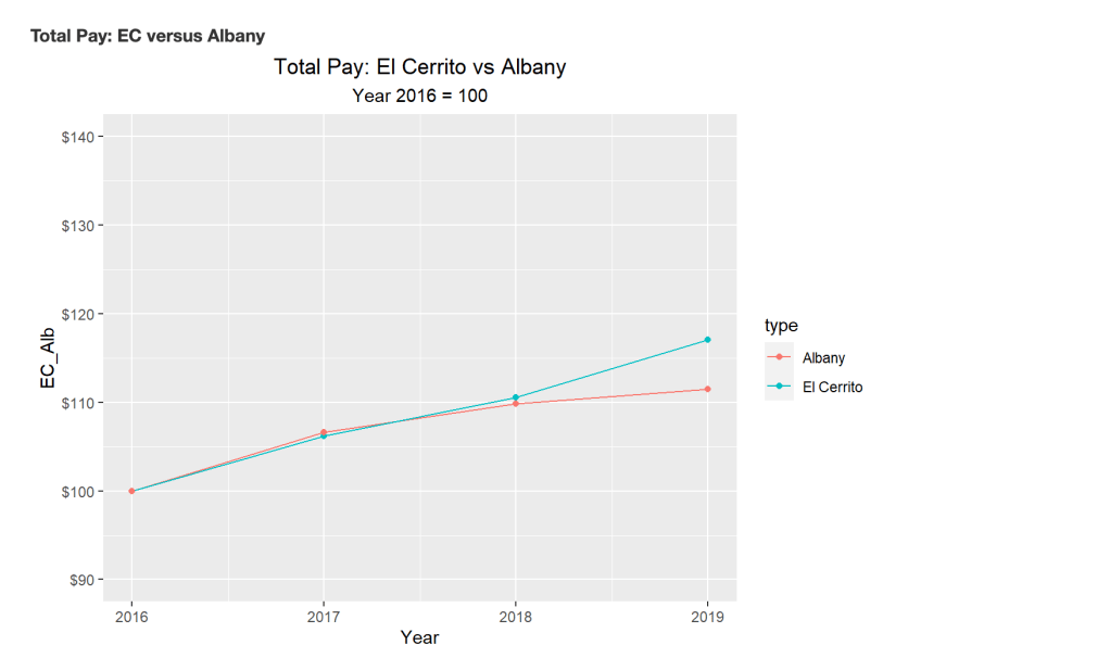
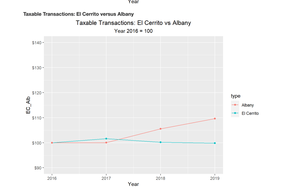
One of our local residents put together some graphs on El Cerrito finances for the years 2016-2020. I think this is a great way for us to see some of these issues visually. I know it was super helpful for me. At the bottom are links to the data sources used to create the graphs. For me what stood out the most is the dramatic increase in expenditures that corresponds with the dramatic lowering of our ending General Fund Balance.
Sources of Data
Comprehensive Annual Financial Reports (CAFR) http://el-cerrito.org/1288/Financial-Transparency-Site
Employee Compensation https://transparentcalifornia.com/
San Francisco Area CPI: https://data.bls.gov/timeseries/CUURS49BSA0
Taxable Transactions https://www.cdtfa.ca.gov/dataportal/dataset.htm?url=TaxSalesCRCityCounty
